NOT because it's good
NOT because it's intuitive
because designers told us it's good so most idiots say "this is in, it's good"
It's as bad as fucking fashion, for fucks, fucking sakes.
I'm SO over it, websites, phone apps, now phone OS's - everything is going SINGLE colour FLAT, no shading, NO DIVIDING LINES (ARGH) just complete white space (or any other colour)
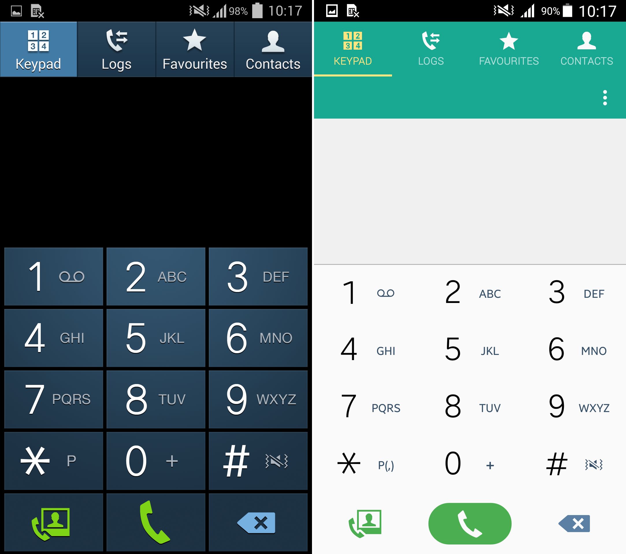
The new dialler on the Samsung iteration of Lollipop is disgusting. All the numbers are just on one big flat shaded mess.
Forget about what's "cool" forget about aesthetics, tell me which one of these looks easier to hit the fucking numbers on?
http://www.sammobile.com/wp-co...
It's 19'th level, fucking desk smashingly frustrating. I'm a NERD, I'm a GEEK, I'm a fucking IT guy, I WANT TO DO THINGS AS FAST AS HUMANLY FUCKING POSSIBLE. The only thing holding me back should be my fingers, my computer or my device. I should not be sitting there mentally processing shit because it's obfuscated with poor design.
The textless icon 'fad' (which saves them translation costs) is probably the worst part. It's full spec kitten stamping insanity. I don't give 2 fucks if the wifi icon is ubiquitous, they have now dozens if not hundreds of icons for applications across the world on iOS, android, windows which are fucking meaningless and we're meant to know what they do.
"Well just press them to learn once" NO - a, that could be a bad thing I don't want to do and b, EVERY time I see the icon, I wonder "is that?...." I shouldn't think that. I should see the text too. The more I can instantly relate to the better.
I even think (despite it likely being ugly) that we should be consider using colours more.
Wouldn't it be nice if the 'send' button was always not only a "play" looking icon on my Android device, but it was LABELLED "send" and it was ALWAYS green.
Delete / trash icon? Always a trash bin, ALWAYS labelled with text, ALWAYS red? That's THREE fast things which will help me very very (very!) quickly identify what i want to click.
I tire so much of the 0.4'th of a second it takes my brain to 'double check' if I'm going to press the right thing. Those 0.4'ths wouldn't exist if this shit was done properly.
I apologise for ranting but this stuff is BAD, it's UGLY and it's SHIT and I'm ultra sick of it. It's hipster, flat, bland, wank for the sake of wank and it's costing me time.
One more thing, I no longer work in IT support. It was hard enough as it is when I did it, I couldn't begin to empathise enough with some poor piece of shit helpdesk guy now, who not only has to do that work but tell them "no click the icon that looks like an old cupboard but with 2 circular dials on it, no it's up the top right, no there's no colour, no there's no label, yeah it looks like........" for fucks sake.
Madness, utter madness.
LABEL things
put COLOUR on things
USE DIVIDING LINES - 1 pixel thick lines to separate sections ain't gonna kill anyone
If you work in the UI / UX industry and support this stuff. Kill yourself
No, I mean it, actually kill yourself, you're a scourge on technology.
