
Journal sootman's Journal: New design somewhat sucks
The 'Read more...' link--the one I always click--is also right aligned. It used to be the very first thing on a line.
'Score' is right-aligned. I much prefer it to be immediately after the comment title, as it used to be. I find it extremely annoying to read a comment and not know if the author is being serious or not. Having to look all the way to the right and then back to the left is almost as bad.
I hate vertical bar quoting. Occasionally, it produces spectacularly bad results.
http://games.slashdot.org/article.pl?sid=06/06/04/048230
http://apple.newbox.org/pics/slashdot/quoting.png
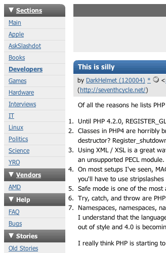
The numbers in lists go left of the margin.
http://developers.slashdot.org/comments.pl?sid=187638&cid=15478428
http://apple.newbox.org/pics/slashdot/numbers.png
In this box below, the checkbox touches the 't' in 'Submit'
http://apple.newbox.org/pics/slashdot/submit.png
The old site used Times for body copy, which I think looks much nicer than a san-serif font.


New design somewhat sucks More Login
New design somewhat sucks
Slashdot Top Deals