Comment Re:Terminology (Score 1) 404
Hey, that gnu is not dead
It's been a pleasure giving you something to smile about in the morning.
Hey, that gnu is not dead
It's been a pleasure giving you something to smile about in the morning.
If you care enough and agree with RMS about the "GNU/Linux" naming issue, you shouldn't have been running Flash in the first place.


The proliferation of debris orbiting the Earth – primarily jettisoned rocket and satellite components – is an increasingly pressing problem for spacecraft, and it can generate huge costs. To combat this scourge, the Swiss Space Center at EPFL is announcing today the launch of CleanSpace One, a project to develop and build the first installment of a family of satellites specially designed to clean up space debris.
This looks like a reasonable method, although I think that at some future point it might be useful to just put at least the smaller stuff in a higher 'parking orbit' for later destruction or recycling. This way you wouldn't lose one vacuum cleaner for each satellite retrieved. And much later down the road, it might be useful to collect bigger units — expended boosters, for example — as raw materials and/or containers. The cost of getting the mass into space has already been spent.
I optimistically foresee a future where much of the stuff sent into orbital space has a recycling function built into the design."
What you call the bare minimum, is still -for me- leagues better than the current alternatives. At the end of the day, the Kindle gives me standard font-types with great legibility, most LaTeX produced stuff I read on my Kindle DX (PDFs fit just right) use Computer Modern fonts - which suck for screen reading.
Gargl, yes, "Computer Modern" is ugly (but they really should be using Latin Modern these days, although that is only slightly less ugly).
But then we are back on topic that people can and will screw up the design. My personal favorite for long non-technical text is actually Palladio (a Palatino clone).
FWIW, regarding your linked image:
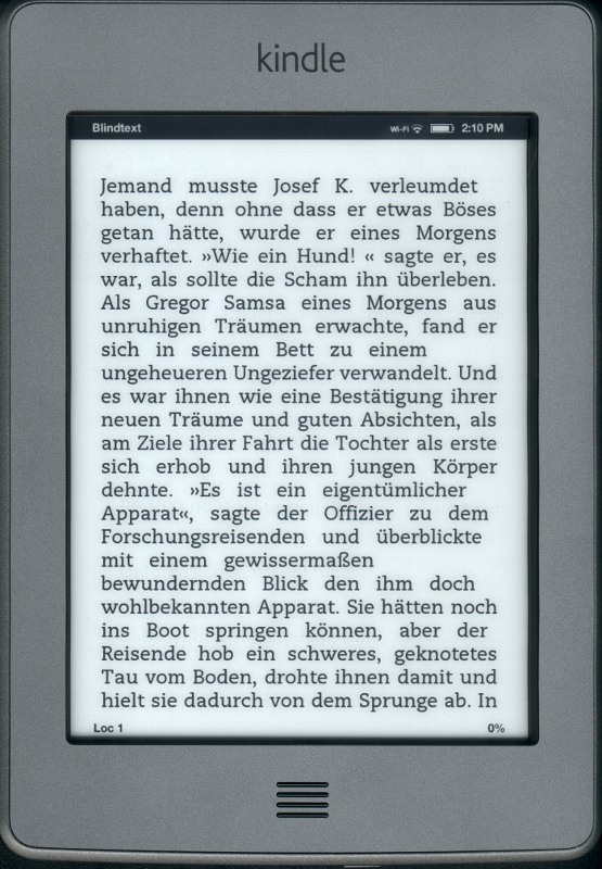
1. the font size in the image you linked is too large for the screen size. Reading a novel at ~ 6 words per line is going to suck no matter what. There is a setting for displaying more words per line (without decreasing the font size), perhaps you should try that? The text seems to use the default type face, the condensed would also be better (in my eyes).
Condensed is harder to read at smaller font sizes and ugly IMO. But the font size was of course also chosen to show that the Kindle doesn't do proper hyphenation and justification and how ugly it can look because of this in a bad case.
2. You are using German text on a Kindle only sold in the USA, are you surprised at the lack of hyphenation? I honestly can't remember if the Kindle does hyphenation in English or not. OK, my bad, it does not (I just checked). I use a smaller font size, so that is less of an issue.
This Kindle Touch is only sold in the USA, but there are other models that are also sold over here and they don't do it better. German is of course a notorious case for word length and therefore you more often see the ugly line breaks because of the missing features.
As a programmer, I'm almost insulted that they don't do better. The Kindle Touch is a really cool piece of hardware (even running Linux) but they screw up so hard with the software. I mean, hyphenation isn't rocket-science and even a bad programmer can implement this easily.
3. Either you don't have paragraphs on that page or the book/text displayed is poorly tagged (is the 'Als Gregor Samsa' a paragraph?). I just checked 3 different books I have and they all have proper paragraph justification.
As I said in my previous posting, this is just one large line of text without any paragraphs to highlight the problems. The Kindle does a "most-of-the-time-justification". It stretches the whitespace between words somewhat to justify the line but if it would have to stretch the words too much, it doesn't justify the lines. Thus preventing big holes in the text at the cost of justification.
If you're reading English texts and using a condensed font, you might almost never see this but it happens also with English text.
The text I used is composed from the beginning lines from several books by Kafka.
Unfortunately Word has something to with typography:
1. bad typography
2. people thinking it produces good typography
The kindle handles text novels just fine? Sorry, no, it doesn't. It only handles the bare minimum for displaying text.
Look at this picture.
Displaying one line of text without any paragraphs. You see no hyphenation, no real justification, no kerning (look at all the space between a 'T' and an 'o'), let alone advanced features like hanging punctuation.
Which, according to most typographers I talked about it to, is not the case with LaTeX. I mean I am sure Lamport knew his stuff, that just his stuff was physics, not typography and design. Besides, defaults for physics journal articles will not necessarily be the same as defaults for a book of literature.
Oh yes, don't use the LaTeX' standard "book" package by Lamport. I completely forgot about that because it's so old. But I don't think it's fair to judge by stuff from the 80s. We don't do that with Word either
There are much better packages for a long time, like "memoir" or "komascript". But those mainly change the page layout and the default settings for fonts. For the cool microtypography stuff you also need something more recent than Knuth's original TeX compiler, like luatex (which shall finally get to 1.0 in 2012) or pdftex.
In short, just install TeXLive or MiKTeX and use that.
If programmers designed eBook formats, they'd have vector graphics support.
I wish they would. LaTeX is typically much better at typesetting than your average artist/editor using Word. All real programmer would use LaTeX right? (No, I haven't RTFA)
Software can't turn you into a great designer any more than it can turn you into a great programmer.
No, it cant. But good software at least has decent defaults that were set by someone that knows his/her stuff.
TFA is actually not as harsh on the programmers as the summary sounds like. Quote from TFA: "We watch as publishers like Random House outsource the design of cherished titles to programmers whoâ"despite their excellence at programmingâ"are not designers."
Programmers should be programming and the design should be done by designers. Pretty obvious, isn't it? So really the publishers should be blamed for not releasing their books as ePubs or - when the book has requirements that ePub can't fulfill - let designers design the more elaborate eBooks.
Of course programmers usually don't know about typography (unless they have an interest in it [hi fellow LaTeX friends] and I suggest you pick up a good book or blog about it, it's really fascinating).
"Essential features" like podcast support. That is a killer for me.
I'm surprised that there isn't a good OSS music player around that includes podcast management at least as good as Amarok 1.4.10 does (Maybe there is but last time I looked I also needed libgpod support so maybe some great programs did fall through).
genius programmers thought it was great to blindly map color to grayscale
Huh, what do you mean? g = (r + g + b) / 3;
That's probably exactly what they did (or what the display driver does as the browser probably doesn't adjust the colors at all).
But when doing it this way, you often get bad contrast (slightly-darker-gray on slightly-lighter-gray). See this page for an illustration with pictures.
Only the versions with the free 3G limit you to Wikipedia and amazon. If you're on WiFi, the browser will render any webpage.
But the browser (an oldish version of webkit) is hardly usable because of color issue (genius programmers thought it was great to blindly map color to grayscale) and the UI. The browser thinks it can act like running on an ipod touch and it feels sluggish and unresponsive and stuttering because of this.
The cost of feathers has risen, even down is up!
