Why not. I'll go into a little more detail since this isn't clear to you for some reason.
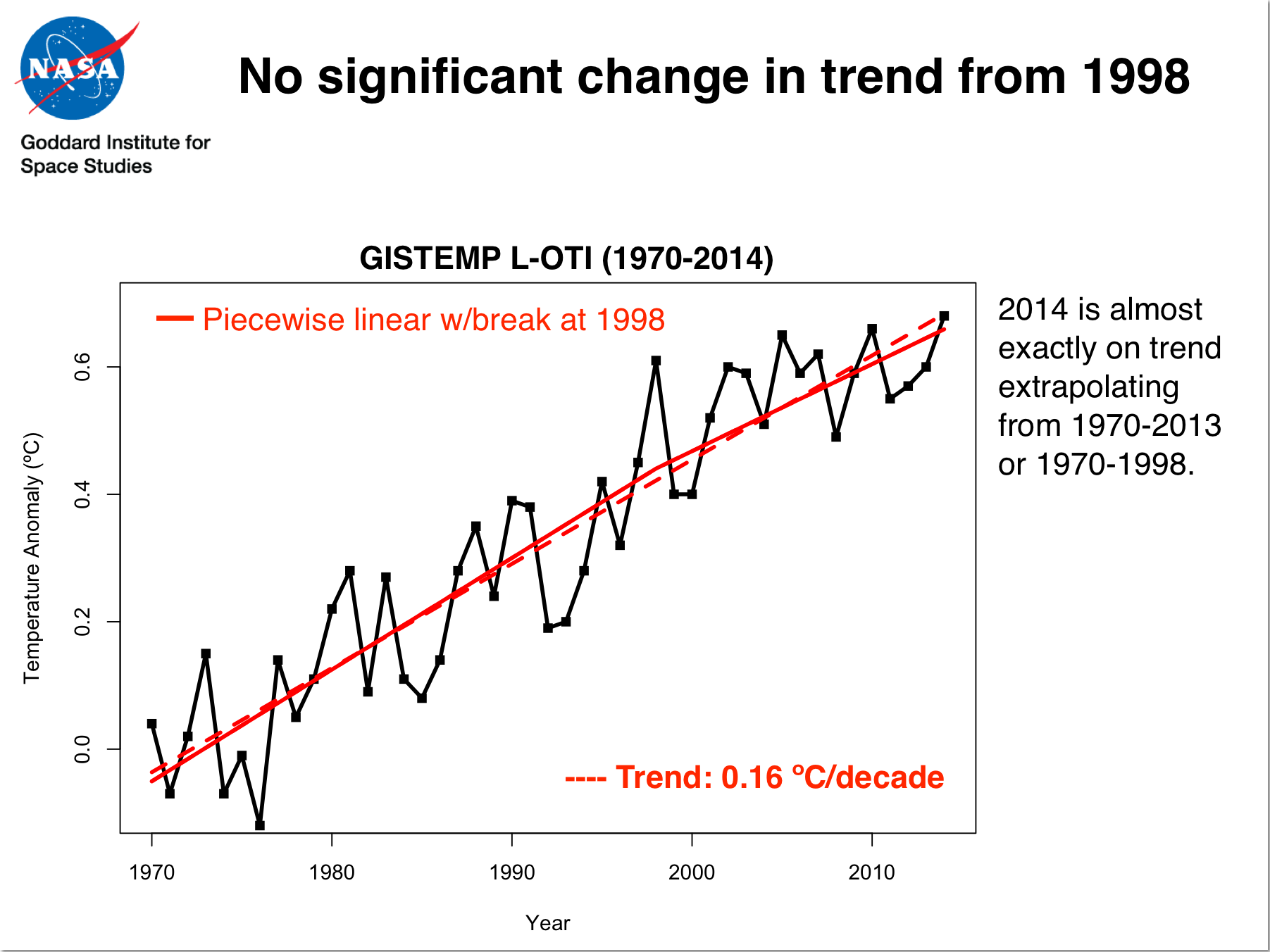
Tamino says: "Assuming global warming continues without slowing down, we would have expected this," with an accompanying graph that extrapolates the long-term trend from 1970.
Then he says: "This is what actually happened," with an accompanying graph clearly showing a long term trend-line from 1970-2015. The point is clear: the recent pause has not affected the long term trend.
He says the recent data fits the long term trend "just about as closely as one could have imagined." He can only be comparing the two long term trends since the recent 15 year trend is less than half that of the previous 30 years. Far from a fit that's as close as "one could have imagined".
Where does he specify how he came up with these graphs and trend-lines? He talks about "the global-warming-continues-without-slowing-down pattern", but that's about as technical as he gets. Most of the post is just a rant.
The title of his blog post is "It's the Trend, Stupid". The whole point of the post is to show how the "pause" hasn't affected the 45 year trend; that it's practically the same as the 30 year trend from 1970-2000.
At the end of the post he writes: "They just don’t seem to realize that the real embarrassment to their precious “pause” is the trend." Again, he is contrasting the 15 year "pause" to the long term, 45 year trend.
In the comments section Zeke Hausfather of Yale Climate Connections says "Looks like we both had the same idea; I made a very similar figure over the weekend for Yale Climate Connections" On the referred Climate Connections post Zeke writes: "While the trend over the past decade is fairly flat, there is a danger in over-interpreting short-term trends in long and noisy time series, as this illustration shows." It's the same theme: the recent pause doesn't effect the 45 year trend.
His illustration looks just like Tamino's and Gavin's: https://i0.wp.com/www.yaleclim... It clearly shows a trend-line from 1970 to 1999 and a trend-line from 1970 to 2015. It does not show a recent trend-line which would look "fairly flat", as he acknowledges above.
Gavin Schmidt's graph, Tamino's graph and Zek Hausfather's graph all look like this: http://www.woodfortrees.org/pl...
None of their graphs look like this: http://www.woodfortrees.org/pl...
Does that help clarify things?
