Kato Description
Kato makes it easy to get business insights in just three steps.
1. 1.
2. Collaborate and share
3. Get insights from anywhere
You can see your data in new ways
Make informed decisions quickly. Connect, model, then explore your data using visual reports that you can publish, share, and collaborate on. Kato can integrate with other tools so you can quickly get up to speed and work seamlessly with existing solutions.
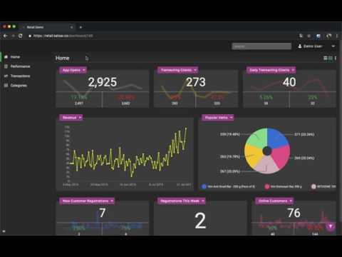
Create personalized dashboards:
Our team will help you identify your KPIs, create user-friendly dashboards, and export, share, or publish critical data across multiple platforms.
Kato Alternatives
SAS Visual Machine Learning
SAS technologies combine to provide powerful tools for visual information. You can access, manipulate, analyze, and present information in visual formats. SAS Visual Machine Learning allows you to expand your analytics by using machine learning and deep learning capabilities. This makes it easier to visualize and report better. Visualize and discover relationships in your data. You can create and share interactive dashboards and reports, and use self service analytics to quickly assess possible outcomes to make data-driven, smarter decisions. This solution runs in SAS®, Viya®. It allows you to explore data and create or adjust predictive analytical models. Analysts, statisticians, data scientists, and analysts can work together to refine and refine models for each group or segment, allowing them to make informed decisions. A comprehensive visual interface allows you to solve complex analytical problems. It handles all aspects of the analytics lifecycle.
Learn more
Gist
Your structured data can be used to create engaging and connective microsites. Share insights with both internal and external audiences. Simple, intuitive interfaces are available for browsing structured data. You can share analysis by embedding visualizations in reports and articles. Using shared annotations, teams can publish, update, collaborate, and collaborate on data visualisations. By creating data visualization interfaces and browsable galleries, you can understand the depth and breadth of a collection. Engage more with your employees and customers by contextualizing collections using user insights and timely articles. Fluid, interactive data visualizations bring data to life. Engage your audience with eye-catching visualizations online. You can embed visualizations on your website and encourage dialogue with user annotations. Gist is open source under the GNU General Public License.
Learn more
ibi WebFOCUS
ibi WebFOCUS, a comprehensive platform for business intelligence and analytics, empowers organizations to make informed decisions based on data-driven insights. It provides a set of tools that allows users to explore, create and analyze analytics content. This includes data scientists, developers and business analysts. The platform allows for the creation of sophisticated dashboards, reports, and visualizations. This facilitates seamless sharing and distribution throughout the enterprise. WebFOCUS is designed for scalability and can be deployed in hybrid environments or on-premises. Cloud-native architecture allows for efficient deployment and management. Integration capabilities enable connection to multiple data sources, promoting an unified data strategy. WebFOCUS integrates AI and data-science functionalities, such as natural language queries.
Learn more
SAS Visual Data Science
Access, explore, and prepare data while discovering new patterns and trends. SAS Visual Data Science allows you to create and share interactive visualizations and reports using a single interface. It uses machine learning, text analysis, and econometrics to improve forecasting and optimization. Additionally, it registers SAS and open source models within projects and as standalone models. Visualize your data and find relevant relationships. You can create and share interactive dashboards and reports, and use self service analytics to quickly assess possible outcomes for better, data-driven decisions. This solution runs in SAS®, Viya®. It allows you to explore data and create or adjust predictive analytical models. Analysts, statisticians, data scientists, and analysts can work together to refine and refine models for each group or segment, allowing them to make informed decisions.
Learn more
Pricing
Pricing Starts At:
$10 / mo
Free Trial:
Yes
Integrations
Company Details
Company:
JungleWorks
Year Founded:
2017
Headquarters:
United States
Website:
jungleworks.com/kato/
Recommended Products
Our Free Plans just got better! | Auth0 by Okta
You asked, we delivered! Auth0 is excited to expand our Free and Paid plans to include more options so you can focus on building, deploying, and scaling applications without having to worry about your secuirty. Auth0 now, thank yourself later.
Product Details
Platforms
SaaS
Type of Training
Documentation
Customer Support
Online
Kato Features and Options
Business Intelligence Software
Ad Hoc Reports
Benchmarking
Budgeting & Forecasting
Dashboard
Data Analysis
Key Performance Indicators
Natural Language Generation (NLG)
Performance Metrics
Predictive Analytics
Profitability Analysis
Strategic Planning
Trend / Problem Indicators
Visual Analytics
Kato User Reviews
Write a Review- Previous
- Next